An Introduction to Constraint Based Design Systems
Over the course of my 15 years of work in design and engineering, I’ve spent an enormous amount of time thinking about, talking about, building, and maintaining design systems — the structures that make up the foundation of modern user interfaces on the web. Particularly as I’ve grown into more and more of a specialist in this area, I’ve made it my responsibility to make sure my team(s) are all working from a shared technical perspective. This is especially important for designers and frontend engineers, as they operate in distinct but overlapping domains.
The proximity of the design and frontend engineering domains presents an interesting conundrum: both share a partial vocabulary and areas of concern — colour, typography, layout, permutations of state, etc. — yet these concerns come with distinct considerations and methods of execution in each domain. You’ve likely had (or heard) conversations or debates stemming from these differences before: a designer may not understand why an engineer cannot build a seemingly simple interface element, or an engineer may not comprehend why their layout being a marginal number of pixels off from a design specification is causing the designer frustration. These conversations often stem from a misalignment between designers and engineers that can, at the surface level, be hard to make sense of: shouldn’t these two be speaking the same language?
At its worst, this misalignment between design and engineering can present significant challenges at the organizational level: interface designs and the reality of codebases can become so divergent that teams are constantly forced to make calls between quality (or faithfulness to the designs) and speed — a choice no one enjoys making. Where those decisions aren’t made explicitly, features and entire products can get held up for inordinate amounts of time as colleagues attempt to reconcile these differences on a case by case basis — or, barring time being available for this, these differences can be relegated to no one’s favourite to do piles: technical debt and design debt.
These challenges, among others, are what make the successful implementation of design systems a necessity for teams collaborating on digital products. When designers and engineers operate from a shared understanding and point of departure, they unlock the ability to create work that is inherently consistent, repeatable, flexible, and greater than either could devise in isolation.
This premise is what lies at the heart of this article, which in turn has been born from years of my own experience in onboarding and mentoring engineers and designers in the area of design systems. In order to avoid delving into domain specific concerns, this article goes heavy on theory and application, and light on implementation. While some implementation details are necessarily touched on, this article is not meant to inform the specific implementation of a design system. Rather, my intent is to present a rigorous conceptual foundation from which any effective design system on the web may be constructed or analyzed.
Let’s get into it.
What is a design system?
It’s important to begin by acknowledging that design systems — despite the current fervour they enjoy in the tech industry — are not a new concept. Humans have been designing things with great intent for millennia, and systems which formalize those designs have existed in some form or another for nearly as long. Design systems practitioners thus have a deep and rich history upon which to draw.
But what exactly is a design system? I find this excerpt from an article on Figma’s Design Systems website to be a great starting point (though I’ve swapped their use of the term ‘design pattern’ for ‘design system’, for consistency):
[…] a design system is a formal way of documenting solutions to common design problems. Design systems are a universal resource to align best practices, describe the elements of good designs, and most importantly, provide a repository so that other people can easily reuse these solutions. Why invent the wheel when a perfectly good one already exists?
Modern designers rely on design systems to quickly get new designers up to speed on brand nuances, capture collective wisdom across time and people, provide teams with a common language, eliminate wasted time spent on “double work,” and ensure the end user gets a predictable experience no matter the medium or designer.
The objective of capturing collective wisdom across time and people is crucial. Design systems do not exist purely for the sake of defining rules. These rules (or solutions) must be the result of incisive and collective problem solving, and these solutions should be able to be reused by others for as long as the parameters defining those problems remain unchanged.
The above description of design systems provides a good theoretical starting point, but how do design systems manifest in practice? This answer will vary between different fields of study (city planning, architecture, graphic design, computer programming, etc.), but when it comes to digital products, I define a design system as containing:
- A brand design specification (high-level typography, colour palette, layout sensibilities, etc.)
- A reusable component library — that is, a collection of components which convey that brand design through practical applications (discrete typographic elements, iconography, interactive elements, etc.)
- A modular codebase, which turns these components into reality for end users
Thus, a design system defines not only the look and feel of an organization, but also the way in which users interact with an organization’s digital products and services. In other words: the design system directly informs the implementation of the user interface.
The roles and challenges of user interfaces
User interfaces (and thus, the design systems that underpin them) are at their most effective when they remove the friction that exists between an organization’s users and their goals. Those goals must, in turn, inform the implementation of the design system. In considering these goals, we must be careful not to confuse means with ends:
People don’t want to use your software.
They want to lose weight, laugh, be entertained, get smarter, spend time with loved ones, go home on time, sleep adequately, eat good food, be happy.
Your product is only as good as the experiences it enables people to have.
— @shl
All interfaces crafted by designers and developers must originate from the needs of an organization’s users. In order for an interface to successfully deliver on this premise, it must be:
- Consistent (to build trust and familiarity)
- Predictable (to set expectations and reduce cognitive load),
- Efficient (to honour that most important resource — time)
- Accessible (to make the interface available to as many people as possible)
It is thus the job of the design system to dictate how an organization should create user interfaces that are consistent, predictable, efficient, and accessible.
While these attributes are critical for an organization’s users, it’s often forgotten that they are also important for the designers and engineers tasked with building these interfaces in the first place. A design system that is not consistent, predictable, efficient, and accessible for an organization’s designers and engineers can hardly be expected to be serviceable in the crafting of great user interfaces.
Herein lies the challenge, especially for growing organizations: solving for consistency, predictability, efficiency, and accessibility becomes harder as the number of people working in this problem space — and the size of the problem space itself — increases. This is down to the relationship between the scale of systems and their entropy — or, in overly simplified terms: the tendency of systems to move towards disorder. In order to keep our systems in check, we need to focus on the parameters that define them. This is where the use of constraints becomes critical.
Embracing constraints
Effective designs optimize for constraints. This applies to any form of design: architecture, engineering, software, product design, and so on. These constraints are not just useful, they are critical: a beautiful building not designed for the constraints of tectonic movement and climate variability will collapse, and products not designed for the myriad constraints of the web will never amass a critical user base. Furthermore, a design system without adequate constraints will quickly grow into a disordered mess, especially as more contributors join in and more design problems are encountered.
Systems built for constraints tend towards greater degrees of maintainability and learnability — making them more stable, faster to iterate on, and easier to learn in the first place.
Let’s use a simple example to demonstrate.
Constraints in practice: spacing scales
How many times have you been working on a layout (either as a designer or an engineer) and thought to yourself, ‘How many pixels should this be placed away from that?’ How many times have you gone with your gut, trying out variations of numbers until it ‘looked right’? How many times have you had to ask your designer for a redline, or ask your engineer to change a 13 pixel margin to a 14 pixel margin?
Now, how many times have you encountered something designed or coded by someone else on your team where they also adjusted a layout until it ‘looked right’, but the measurements they used were different from yours? How do you decide which one is correct? And are you going to remember that pixel value next time you need to space something out? How would a new hire know which value to use? Isn’t this exhausting? Wouldn’t you rather be working on something more important?
Of course you would. Let’s talk about spacing scales.
The idea behind spacing scales is this: any (and every) given layout should use only certain, consistent increments of space between discrete elements in that layout. Need an input to be some distance away from its label? Pick a value from the spacing scale. Designing a grid layout? The gutters between each column and row are sized with a value from the spacing scale, too. Every element of your UI, with rare exception, should be spaced apart from other elements by an interval of space found on your spacing scale.
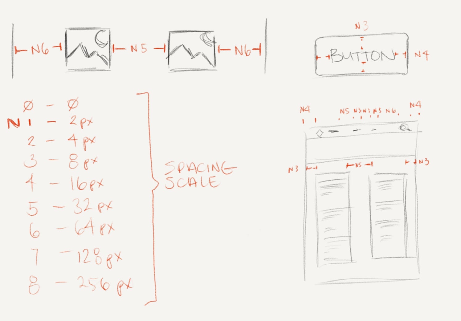
Spacing scales are ‘modular’ in nature (as opposed to a continuous range), where each step in the scale is a given proportion larger than the previous one. A spacing scale could be based on powers of 2, for example (4px, 8px, 16px, 32px, 64px, …), or something more complex. The important thing is deciding on a scale that makes sense for the team, baking that scale into your design tools and codebase, and then sticking to it.
Spacing scales are a great example of a constraint-based design pattern that solves problems at many levels. They effectively eliminate the use of ‘magic numbers’ (unique values chosen by feel or with otherwise illogical origins), and they greatly reduce time spent on bikeshedding, while also creating a harmonious, rhythmic, consistent layout across entire interfaces and products. Once designers and engineers get familiar with these scales, they can even reduce the degree to which designs need to be redlined by the designer (or inspected for precise values by the engineer) — repeated intervals become recognizable at a glance and thus speed up ideation, implementation, and iteration. For recently hired designers and engineers, spacing scales also reduce the time needed to learn and internalize a design system.
Especially when well implemented in design tools and codebases, spacing scales push layout design towards a process that is more parametric and less idiosyncratic. Importantly, this does not mean that using spacing scales or constraint based design systems kills creativity. It is, after all, still up to designers and engineers to define spacing scales and other responses to constraints in the first place, and problem solving within constraints is itself a highly creative act.
Putting constraints to work
Scales and other parametric values can and should be used not only for spacing units, but also for grids, font sizes, colour palettes, and more. By constraining the possible values and variations in a design system, we can reduce the number of things a designer or engineer has to learn about that design system. This also enforces consistency and predictability at a high level. The decision of what attributes should be mapped to constraints within a design system is one that is likely to vary between organizations, but to provide an example, here’s what the design system I headed up development on at Ellii defined in terms of parameters, and how many values were defined for each:
- breakpoints (4)
- colours (~50 — though we only relied on roughly a quarter of these in regular use)
- drop shadows (4)
- font sizes (9)
- letter spacings (5)
- line heights (4)
- border radiuses (3)
- spacing increments (8)
With just these 8 parameters and (aside from our colour swatches) a small set of values for each, we were able to craft a design system that was tightly constrained yet incredibly flexible. These core parameters in large part defined the implementation of everything that ended up on screen, from minute typographic details to entire page layouts and complex interactive components. It also allowed our designers and engineers to design, build, and iterate quickly within a broad but well defined conceptual sandbox.
Methods for implementing these kinds of constraints within an organization’s design tools and codebase can be nearly as varied as the composition of the design systems themselves. However, given the explosion of interest in design systems in recent years, a growing number of options are gaining popular support. Design token plugins for Figma, for example, are providing designers with programmatic ways of codifying and using design system constraints within their wireframes, mockups, and prototypes. As a frontend engineer, I’ve been making use of (and loving) Brent Jackson’s Styled System library since it first emerged in 2017; Theme UI is another appealing option. For those not working in React, a constraint based design system can easily be implemented in vanilla CSS — Tailwind, a popular functional CSS library, is even geared towards use within design systems.
However, simply implementing constraints when constructing a design system is not enough. Design systems are typically not static — organizations’ needs change over time, new problem spaces are opened up, and sometimes these spaces require solutions to problems that were never considered when the design system was implemented. Working with constraints, then, is not a ‘set it and forget it’ affair. We must learn how to effectively manage constraints over time.
Surface area, volume, and the complexity of systems
In a simpler world, the parameters and values that underpin a design system would be decided on once, and then used forever. Reality, of course, is rarely so straightforward.
Iterations on design systems must be treated with caution. Sometimes, a seemingly simple adjustment to a design system is all that’s required — an additional colour swatch here, an extra font size there. However, even the simplest of changes poses the risk of adding exponential complexity to a design system. To help people understand why, I find it helpful to take a brief detour into the world of geometry (I promise this will be painless).
First, a quick recap of terminology: when describing three dimensional objects, we can use the term ‘surface area’ to describe the size of an object’s exterior (e.g. the combined size of a cardboard box’s outer panels), and the term ‘volume’ to describe the size of the space contained by an object (e.g. the amount of space inside that same cardboard box). When three dimensional objects grow, something interesting happens in the relationship between their surface area and their volume — they don’t grow at the same rate:
Consider a cube. As the cube grows in size, its volume grows faster than its surface area. To be precise (and forgive me if this seems too obvious to be worth stating) its volume is 𝑥³, while its surface area is 6(𝑥²) for a given edge-length 𝑥.

Now, let’s consider a colour palette — say, the most minimal of colour palettes, black and white. With just black and white in our palette, we can only create 2 different colour combinations:
- White
- Black
- White/black
- Black/white
What happens if we add a third colour — say, red? How many colour combinations can we create now?
- White
- Black
- Red
- White/black/red
- White/red/black
- Black/white/red
- Black/red/white
- Red/white/black
- Red/black/white
By adding just a single colour to our palette of two colours, we’ve tripled the amount of colour combinations available to us. Now imagine how adding a single colour creates variations not just in the colour palette itself, but in the amount of possible combinations with other design system parameters like font sizes. This growth relationship sounds familiar, doesn’t it?
A design system’s distinct parameters, and the values those parameters can take on, can be considered the surface area of a design system: collectively, they outline of the space of possibilities that the design system can produce. Every time that surface area increases — one more colour, one more font size — the volume of the design system, or the combined ways in which all those parameters and attributes can interact as a whole, increases at an even faster rate.
Along with this growing combinatory space, we also need to consider the qualitative complexity introduced by changes to a design system. Returning to the example of adding a single colour to a colour palette, a number of questions immediately come to mind:
- Why is this colour needed?
- What should this colour be named?
- Is this colour intended to carry a semantic meaning? If so, what?
- Where should this colour be used? Where should it not be used?
- What other colours in our design system does this colour work well with? What colours should it not be combined with?
- Can it be used accessibly with other colours in our design system?
- Will variations of this colour be needed in addition to the colour itself?
As the volume of a design system increases, so too does its complexity. Some complexity in any design system is unavoidable, and to a degree it can even be desirable as a means of expressing versatile possibilities. However, too much complexity in design and engineering inevitably leads to disorder — inconsistencies, unpredictability, inefficiency, and inaccessibility, the exact things the design system aims to reduce in the first place.
This is not to suggest that design systems should not be iterated on over time, or that the constraints placed on a design system during its formation should be immutable. All design systems that exist for long enough will require modification. The point is that a system’s constraints and their implications must be a permanent concern for design systems practitioners — and that changes to those constraints must be made with considerate intention.
Summary: design systems and cohesion
A design system is, at its core, a unifying tool. Implemented effectively, design systems reconcile an organization’s intent with its artefacts, by creating cohesion between the makers of those artefacts — that is, the organization’s designers and engineers.
Great design systems go beyond design and engineering staff, though; they are critical in producing an end result that the entire organization can depend on, from quality assurance and management to communications and commerce. Maintaining the stability of a design system, then, is no small feat, and this task must be afforded the proper time and attention to do so.
Especially as the number of people contributing to and making use of a design system grows, effective communication becomes critical. Designers and engineers must be in regular, constructive dialogue, and those leading the development and maintenance of design systems must have tight feedback loops with the organization as a whole. When this is not the case, the risk of a design system falling into disorder grows. This can have disastrous impacts across entire organizations.
In my experience, the best way to prevent this kind of disorder from growing is to ensure that design systems practitioners meet regularly and proactively — of course, always keeping the system’s constraints in mind. Some organizations may be large enough to support a dedicated, cross-functional design systems team; in these situations, regular meetings and tight communication loops are hopefully a foregone conclusion. In smaller organizations, where a design system may be built and maintained by designers and engineers who spend most of their time working directly on products, booking regular meetings (either biweekly or monthly) to focus on the design system is essential. In organizations of all sizes, keeping asynchronous channels of communication open to everyone is also important (e.g. a public design systems channel on Slack), as is working to eliminate any extant silos between designers and engineers, and building effective cross-functional teams.
It also bears stating that great design systems require great documentation. Even with a multitude of well thought out constraints in place, we must remember that new hires may not be familiar with design systems in principle, or with the problem space that your particular design system operates within. (You can, of course, feel free to send this article around to those not familiar with design systems — but you should document your specific system well, too.)
Constructed and maintained with a foundation of proactive and informed communication, design systems become an incredibly powerful organizational asset. They enable the creation of consistent, predictable, efficient, and accessible user interfaces, which in turn bring end users closer to their goals. Properly implemented, they also do this at scale: an organization’s designers and engineers who are not themselves design system contributors save immense amounts of time by simply reusing the artefacts produced by the design system (its components), and can thus focus on building proverbial rocket ships without worrying about manufacturing their own nuts, bolts, and fuel sources.
This, at least, has been my experience. I hope that this article might help make this your experience, too.
Acknowledgements
This article draws deeply on my own work in crafting successful design systems at multiple organizations over the past 8 years, as well as my experiences as a designer/engineer hybrid in the years before that. My work, in turn, has particularly benefitted from learning from Adam Morse and Brent Jackson, and I would be remiss not to thank them for their inspiration, guidance, and incredible setting of examples through the years. Further thanks go out to Adam for providing feedback on this article prior to its publication.